The homepage on any website is the shop window to your business. A good website homepage will make it easy for visitors to know exactly what it is you offer and whether it can help them with the problem they have.
In this article, we examine the key elements required on any good website homepage design and what the purpose is of each of them.
The biggest mistake people make is thinking they need to have everything their business offers on the website homepage. Having too much information is a real turn off and often leads to confusion. In this busy world we live in, people don’t have time to stick around to try and work out what your business does and if you can help them.
Just like a shop window, a few seconds glance will give an indication of what the shop sells. What a well-dressed shop window will do is pique a passer-by’s curiosity to either go into the shop or make a mental note to call in one day in the future when what the shop offers becomes relevant to what the passer-by needs. Your website homepage is no different.
To attract the right clients to your business, your website homepage needs to provide the following information in a matter of seconds:
- What does this business do?
- What can they do for me?
- How can I buy it?
A web visitor does not need to know every single nuance and every single service you offer at this point so avoid information overload.
Would you tell someone you have just met everything about you? No, of course not. That would be overkill. Apply the same principle to your website.
Remember the reason why they are there in the first place is for their own benefit (looking for a solution to their problem) and quite frankly are not interested in the detail of who you are, not just yet, that comes later.
So, how do we go about attracting the right potential client through our website?
If we create the perfect shop window which piques a prospect’s interest, it begins to create an awareness of us. This awareness, if nurtured in the right way, will lead prospects to take small actions and our business becomes the potential solution the prospect is looking for.
Specificity and simplicity are key. Confusion simply leads to inaction and web visitors just move onto the next website.
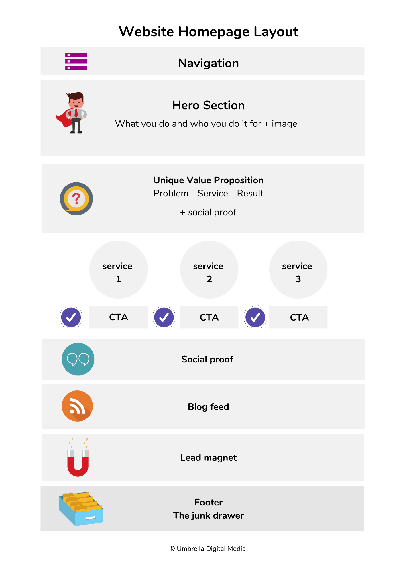
The key homepage areas I will focus on in this article are:
- Navigation
- Hero Section
- Services
- Calls to Action
- Social Proof
- Lead Magnet
- Footer
What Makes a Good Website Homepage?
Navigation
1. KISS – Keep it Simple Stupid*
The navigation area needs to be kept simple, straightforward and clear. The temptation for many businesses is to try and be ‘clever’ with the navigation labels so they sound a bit more exciting than ‘about’ or ‘services’.
Do not ask your prospect to use those precious first few seconds of their visit to try and work out what it is you do. Make your navigation easy to understand.
*KISS, an acronym for “keep it simple, stupid” or “keep it stupid simple”, is a design principle noted by the U.S. Navy in 1960 – Wikipedia.
2. Less is More
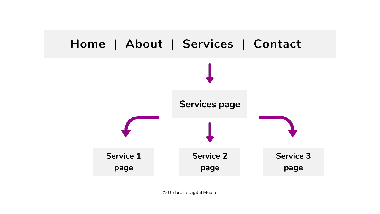
Stick to between 5-7 menu options only (no dropdowns either). If you have lots of different services, then categorise them into larger collectives. Each ‘collective’ becomes a click through to its own page for more detail.
For example, a ‘services’ page will click through to a summary page of services and from there, each service will have its own dedicated page.
3. Internal Website Links Only
Any links in this section should only link to other pages on your website. Move any social media icons from the top to the footer (more on that later). Why? Your web visitor has only just landed on your website, so why would you tempt them to click away to your Instagram profile and lose them from your website?
Hero Section
The hero section is the area where you need to encapsulate in a couple of seconds what it is you do and who for. The web visitor needs to know they are in the right place to make a decision to stick around for a bit longer.
Remember the shop window? You need to stir your visitor’s curiosity easily and get them to understand what it is you do and who for, just like a shop window gives a quick snapshot and gets noticed by potentially the right people who may, one day, go into the shop.
This section is called a hero section for a reason. But the hero is not your business, the hero is your prospect, so make them think that your website exists just for them and the problem they have.
An image says a thousand words so make sure the image you use complements your messaging and encapsulates the right feeling and tone. If you want your images to have people in them, use real ones of you and your staff and don’t hide behind stock imagery. Images of your business, staff and clients builds trust and helps prospects get to know the business.
Services
‘Confuse and you’ll lose’ – Donald Miller, Author of Building a StoryBrand
You might offer a whole multitude of services. Your homepage is not the place to list them all. The power of 3 is a good design layout. This can be different service types or a choice of entry points if the business offers levels of service, e.g. DIY, done with you, done for you.
The example below shows how to pull together your main 3 services or service levels to give visitors a starting point of where they can begin. (Although I refer to 3 services, you may have less than 3 and that is ok but more than 3 is overload.)
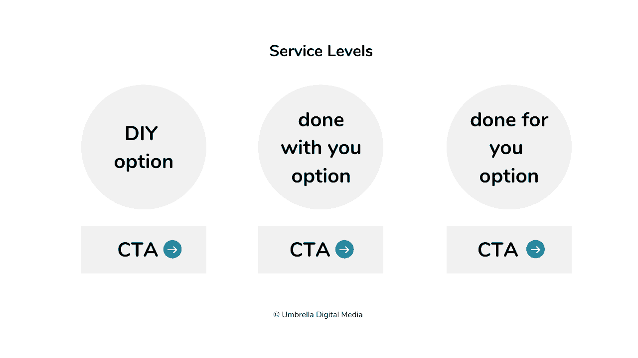
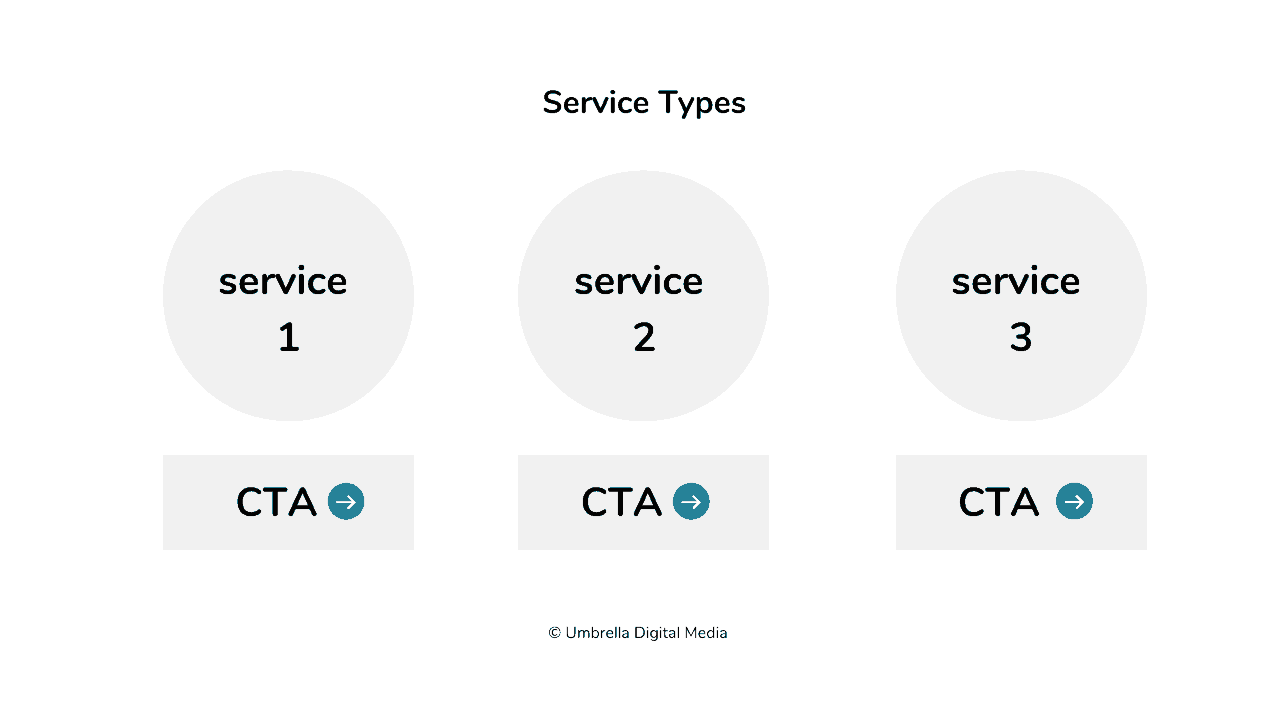
Couple this information with your categorised navigation options and in a small space, still in the first third of your website homepage, and your visitor will already have a good overview of what you do and if they are in the right place.
Calls to Action
By now a visitor will know what you do and who you do it for. With this information, they may experience a heightened awareness of the problem they have, but now they are also aware of a business who may be able to help them solve it.
Clear signposting telling visitors what to do next is crucial to retain the momentum of their interest. Micro-actions, such as clicking a button or a link, are important in directing potential clients in the direction you want them to take.
Use unambiguous and direct calls to action messaging, such as ‘book now’, ‘buy now’, ‘find out more’, ‘book a call’, ‘download now’.
Clear calls to action move prospects onto page 2 which is the desired next step for your website’s customer journey.
Some visitors will not be ready to click through at this stage yet and will continue to scroll down but that is ok.
Social Proof
The power of social proof.
Social proof helps to give our business credibility and builds trust with potential clients. It also gives buyers reassurance. An insightful review about a business or service makes the buying process a lot less scary and builds a buyer’s confidence.
Consumers do not want to feel buyer’s remorse so the website must allay those fears for our prospects.
Effective testimonials or reviews mention tangible outcomes, results or positive changes; the difference your service has made to a client and the transformation they have gone through.
Lead Magnet
A lead magnet is a perfect way to show our expertise, but more importantly, it can help our prospects start to unravel the problem they have.
Give your expertise freely and generously. Make your lead magnet easy to consume with the result of a ‘quick win’ to go some way towards helping with the problem a prospect has.
Gaining a prospect’s email is a privilege these days so create a lead magnet which is valuable to them and nurture them ‘post download’ to steer them a step closer to becoming a client and building a great relationship.
Resources
What is a Lead Magnet and Why do You Need One on Your Website?
How to Promote Your Lead Magnet Without Being Salesy
Footer (aka The Junk Drawer)
The ‘footer’ is a place where things we have not mentioned already, aka clutter goes. Keep mandatory things here such as links to your privacy and cookie policies and links to other pages not mentioned in the navigation.
The footer still requires good thought and careful planning to make it an effective space rather than disorganised clutter.
Social links go in here too, along with professional badges and qualification icons.
Summary
In summary, a great homepage layout should be simple, avoid confusion and provide purposeful information to a prospect within the first few seconds of landing on your website.
Like a well-dressed shop window, your homepage will stir a visitor’s curiosity, bookmarking your business for future engagement, or progress them through a series of valuable micro-actions to potentially bring them a step closer to becoming a good-fit client.
If you need help getting your homepage up to speed, then grab your copy of The 8 Homepage Fundamentals and get your homepage off to a flying start.
