
Think back to the last few websites you visited. What was the purpose of your visit? Did you find the information you were looking for? Did you take some action? Did you feel satisfied with the experience you had whilst visiting the website? How did you feel overall after each experience? I know from personal experience that each website visit can vary enormously between feeling completely satisfied and totally irritated and disappointed.
Keeping in mind your own experience with other websites, how do you think they compare with your own website? Do you know or are aware of the experience your own website visitors go through? It can be difficult to see our own website with an objective view because we are so familiar with it.
This article is going to be helpful for you if you are looking for guidance to review your website from your users perspective and improve the user experience. You will also learn what ‘user experience’ really means and how you can easily apply it, not only on your website but in other client-focused processes in your business too.
What Does ‘User-Friendly’ Mean?
In web design, the term ‘user experience’ or UX for short, is the fundamental design principle of any good website, but what does it mean?
My good friend Piccia Neri, founder of Design for Geeks, and an experienced UX designer, defines ‘user experience’ as being made up of three aspects, Piccia writes:
The 3 essential components that are at the basis of a user’s experience of a product are:
- Look
- Feel
- Usability
First, the look, because the visual experience is essential to establishing understanding, together with credibility and trust;
Then how we feel: is it a joy for us to use this product and interact with it?
And then how functional, predictable and easy to use the product is – that is to say, the usability.
Source: User Experience Design for Everyone, Design for Geeks
As a user we go through the three phases Piccia mentions almost automatically. If finding information on a website or trying to take an action becomes difficult we have to think too much.
In Kenda Macdonald’s book, Hack the Buyer Brain Kenda writes about how our brains are fundamentally lazy, so when we need information we search our own memory banks first. Kenda goes on to say what we put online must be super helpful and valuable to give the consumer a ‘feel good’ factor when they find the information they are looking for. Emotion plays a major role in our decision making so make it easy for your web visitors to associate good feelings with your brand.
How to Easily Make Your Website User-Friendly
Once we understand the theory of user experience and realise that our websites must be empathetic to the consumer journey and not about ourselves, we can begin to apply small but significant improvements to our websites.
Donald Miller, the author of Build a StoryBrand, puts the potential client as the ‘hero’ of any website. As a business, we are merely the guide to help the consumer through their buying process. Putting the consumer at the forefront of anything you do on your website will make for better user experience.
Here are some practical steps to work with on your own website.
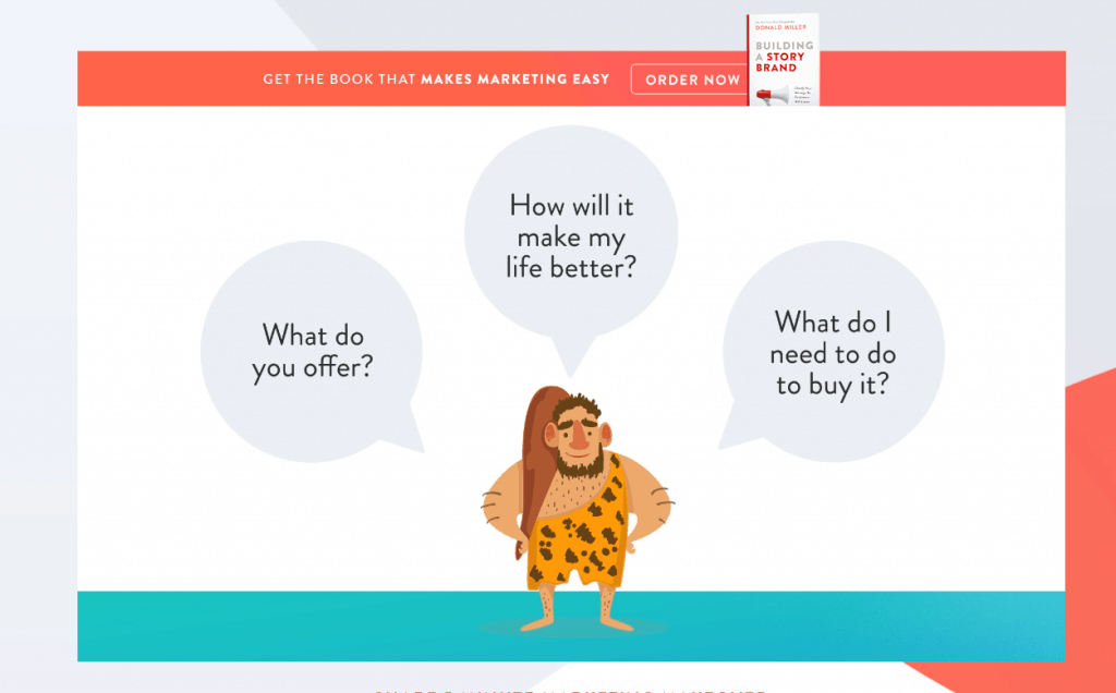
1. Would your web visitor know they are in the right place?
The very first thing your web visitor will want to know when they visit your website is what do you do, who do you do it for and how can it help them? With a limited attention span of no more than about 15 seconds, your web visitor needs to decide whether or not you could potentially be of help to them or not.
In Donald Miller’s Free 5 Minute Marketing Makeover Series, he explains this really well using the analogy of applying a ‘caveman grunt’ to three simple questions a user should be able to answer with a ‘grunt’ and as little brain use as possible.
- What do you offer?
- How will it make my life better?
- What do I need to do to buy it?
Be really honest with yourself about the answers. Enlist the help of someone you can trust to help you with this exercise, but be objective about the feedback you receive. Remember, this is not a criticism of you and what you do, it is an exercise to make sure you have the right messaging to align with potential clients to know pretty quickly if you could help them.
2. Is it easy to navigate your website in a user-friendly way?
At a glance, is it easy to navigate your website without using much brainpower? Do you make it really clear what the options are to take the next step away from the homepage?
Be selective about the key services or products you offer. You may offer a variety of services but stick to three key entry points of working with you. Signposting too much too soon can simply create overwhelm for a user. This overwhelm easily leads to confusion and indecision resulting in no action being taken on a website other than clicking away. When the brain has to work too hard to make sense of it all, no action is the simplest way out.
3. Is it easy to know how to get in touch with you?
Make it a no-brainer for people to know exactly how to get in touch with you and make enquiries. You may prefer a phone or an email enquiry or a message through a contact page; whichever way suits your business best, make it super clear how a user can do that.
[bctt tweet=”Your own website is so familiar to you and sometimes this can make it hard to see your customer’s journey in an objective and empathetic way.” username=”@umbrelladigita1″]
4. Does your website have clear calls to action?
Take away the brain fuzz so a user can make an easy decision. Make it super simple for them to know the ‘one thing’ you want them to do or one specific action you want them to take, on each page of your website.
The no.1 purpose for every page should be clear and easy to action, helping you to generate leads for your business. There are different calls to action you can have, such as a simple ‘contact us’ action, downloading a lead magnet guide or making a purchase. Giving the option of too many calls to action just adds to a user’s ‘brain ache’ and achieves nothing but ‘inaction’ – see point 2.
5. Does your website build trust?
Ultimately, a potential client will want to trust you before they make a buying decision. Being transparent about who you are and how you help people is one thing, but the power of recommendation and social proof is the best way to demonstrate the value you can bring to clients you work with.
Reviews and testimonials help to give an insight into what clients achieve personally and professionally when they work with you. Case studies are a more in-depth way to demonstrate the transformation that happens when your client moves from A to B, a ‘before’ and ‘after’ scenario. Social proof not only showcases a client’s journey, but it is also a way for your user to apply the stories of others to their own situation.
In Summary
This list is not an exhaustive list by any means but important steps to start in the right direction to create a user experience which is super easy and satisfying. Consumers will remember a good website experience and be more likely to come back for more.
Your own website is so familiar to you and sometimes this can make it hard to see your customer’s journey in an objective and empathetic way. It is important to not make assumptions about what your web visitor wants and to not apply your own opinion.
You can seek feedback from trusted colleagues or peers as well as getting feedback from your existing clients to help you work out what it is that helps them. This research is a positive step to help you create a good user-friendly focused journey for potential clients who visit your website.
For more in-depth reading around this key topic, you can read my other articles which will help you:
What You Need to Know to Create an Effective Homepage
How to Use Psychology to Create the Best Homepage
For more information about other steps you can take to improve the success of your website, you can download my free guide: A Quick Guide to Website Success below.